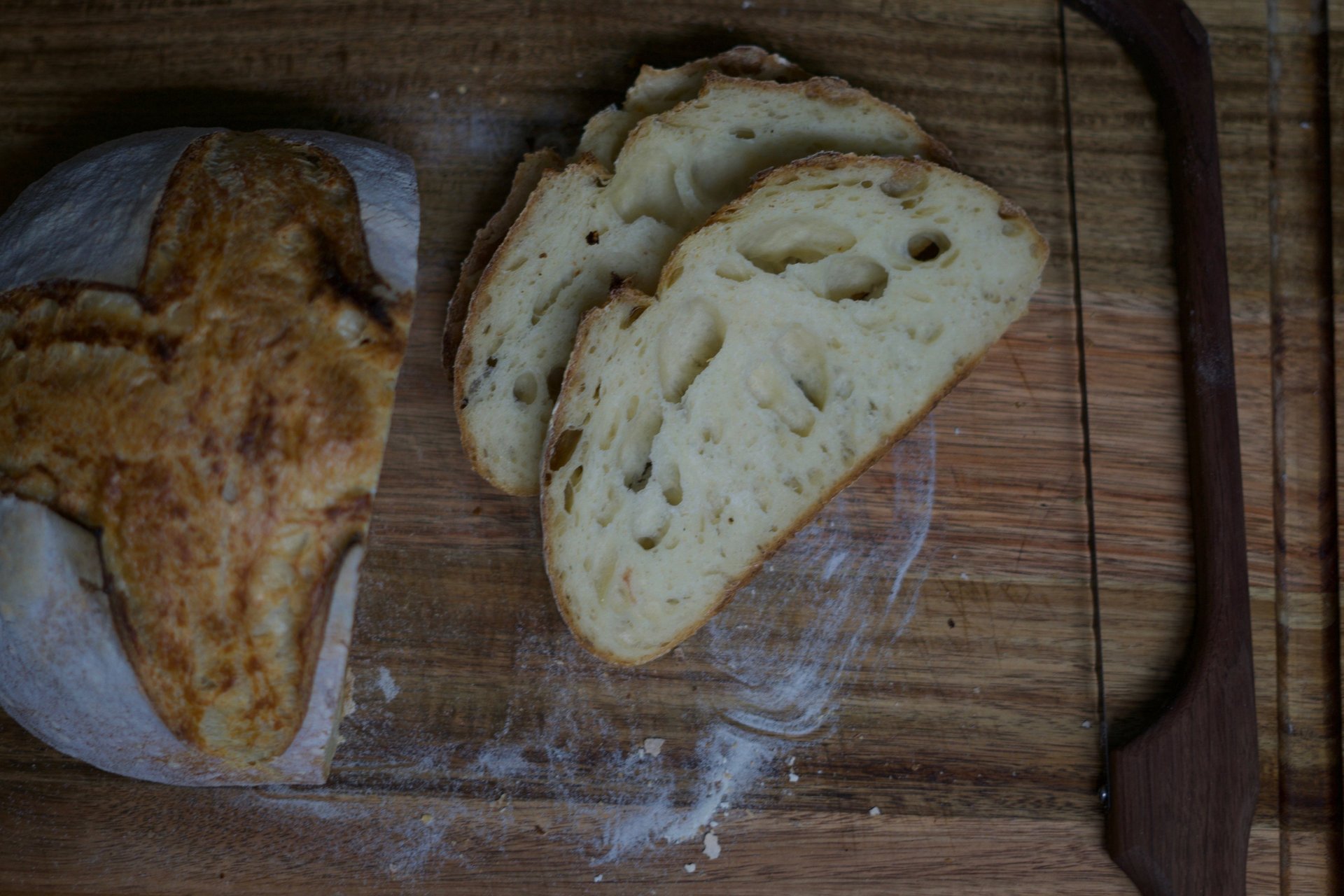
CRUMBY MICRO BAKERY


Crumby Micro Bakery exists to bring people together over simple, thoughtfully made bread.
We believe better food starts with better ingredients. Clean, minimal, and familiar, that ends with something fresh from the oven that feels good to eat and good to share. Everything we bake is rooted in care: slow processes, honest sourcing, and hands-on craft.
Beyond the loaf, Crumby is about community. We plan to use our oven to give back. Baking for food banks and neighbors who need it most, because good bread should be accessible, not precious. At the end of the day, we’re here to make real food, for real people, and to prove that something a little crummy can still be really, really good.
Logo Breakdown
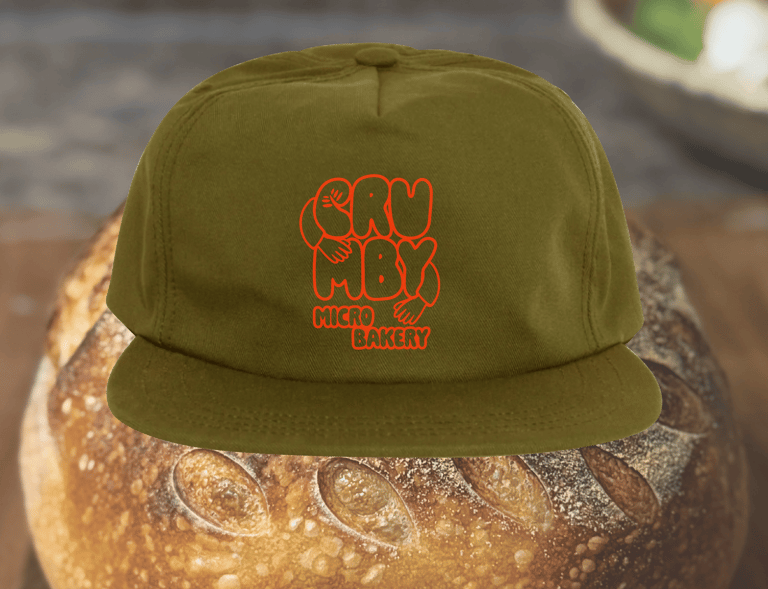
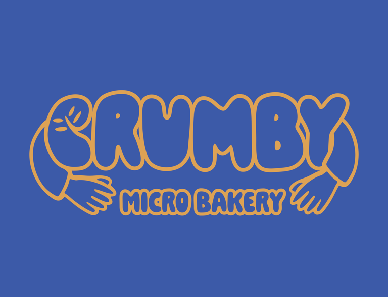
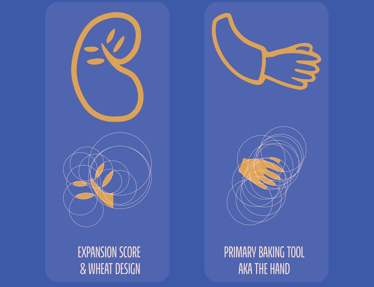
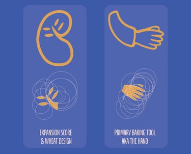
This logo combines two familiar elements of sourdough: the expansion score and the baker’s hand. The score, paired with a simple wheat detail, is shaped into the letter “C" grounding the mark in both process and product. An organically illustrated hand surrounds the mark, holding the elements together and emphasizing the hands-on nature of the process. The result is a straightforward, functional mark rooted in real breadmaking.
Horizontal Lockup
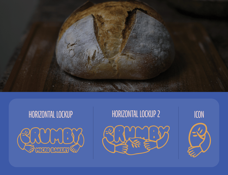
The horizontal lockup pairs the full word mark with the logo mark for clear, readable use across signage, packaging, and digital applications.
Icon Lockup
The icon uses the “C” formed from the expansion score and wheat, held by the illustrated hand, as a compact mark for stamps, labels, and small-scale use.
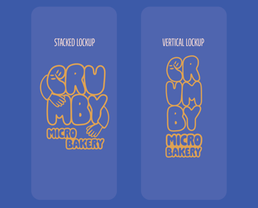
Stacked Logo Lockup
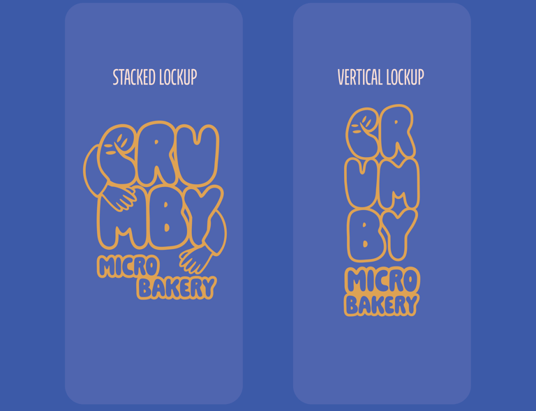
The stacked lockup places the word mark and logo mark in a balanced vertical arrangement for compact use on packaging and signage.
Vertical Logo Lockup
The vertical lockup stacks the logo mark for a straightforward, space creating an efficient layout across various applications.
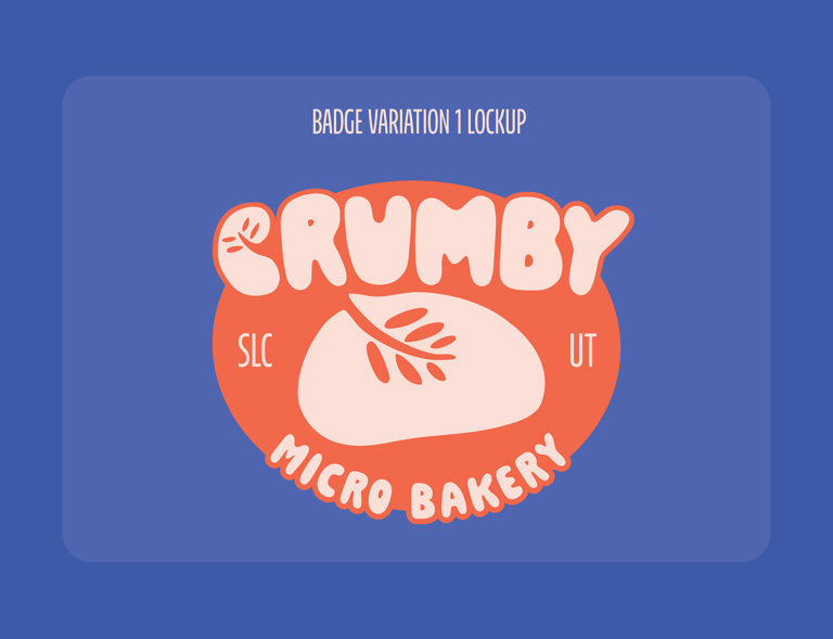
Circular Badge
A circular badge featuring a simple sourdough loaf illustration, finished in a bright orange color for high visibility and easy recognition.
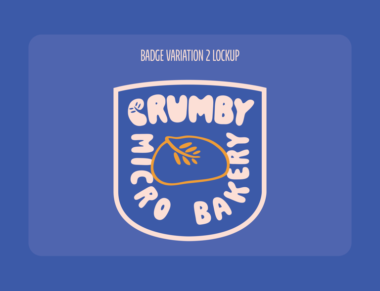
Shield Badge
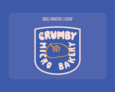
A shield shaped badge using the same sourdough loaf illustration, rendered in bold blue with the loaf in gold for a more structured, heritage leaning mark.
Color Palette
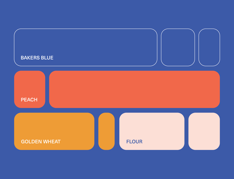
The color palette balances contrast and warmth through a mix of bold and familiar tones. Baker’s Blue provides a deep, grounded base, while Peach adds high contrast energy and visibility. Golden Wheat brings warmth and nods to the core ingredient. Everything is tied together with a soft Flour White, a light peach leaning neutral that keeps the palette approachable and cohesive.
Typography
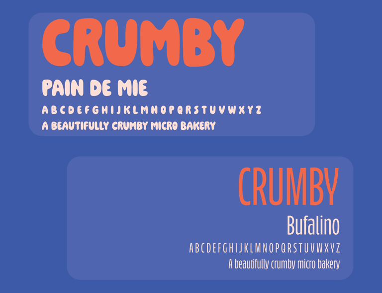
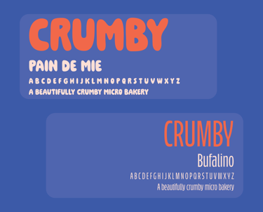
The typography pairs Pain de Mie as the primary typeface with Bufalino as a supporting font. Pain de Mie brings an organic, playful character to the logo mark, reinforcing the handmade and approachable nature of the brand. Bufalino, a clean and more condensed thin sans serif, balances the system with clarity and restraint, keeping supporting text simple and legible.
Illustrations
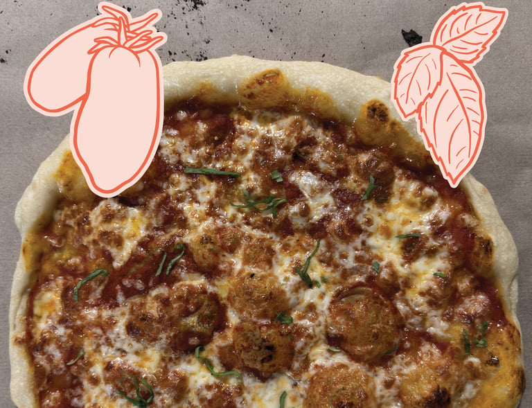
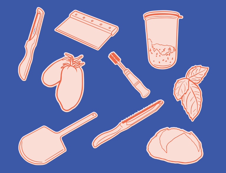
The illustrations highlight the tools and ingredients behind Crumby’s craft. Two items are emphasized as the stars of the brand: freshly baked sourdough bread and sourdough pizza dough. Each illustration is drawn with a simple, organic style, reinforcing the handmade, approachable nature of the products while celebrating the process and care behind them.
Pattern
The pattern uses the bread knife illustration repeated to create a bold, textural background. Its simple, organic line work adds visual interest while reinforcing the handmade, artisanal nature of the brand without overwhelming the design.


Sourdough Bread Label
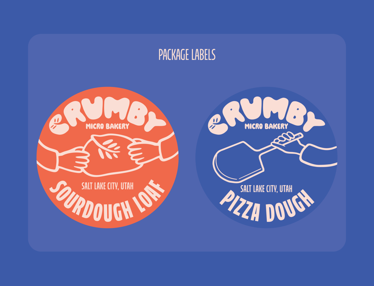
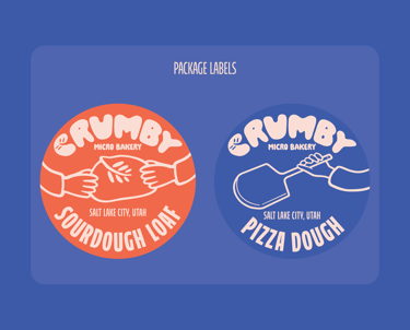
The sourdough bread label features illustrations of hands holding a freshly baked loaf, emphasizing the handmade nature of the product. The design highlights the bread as the star while keeping the overall look approachable and warm.
Pizza Dough Label
The pizza dough label showcases a hand holding a pizza peel, reinforcing the craft behind the product. Set in Baker’s Blue with the illustration as a focal point, the label balances bold contrast with the approachable, organic style of the brand.
Sticker Design
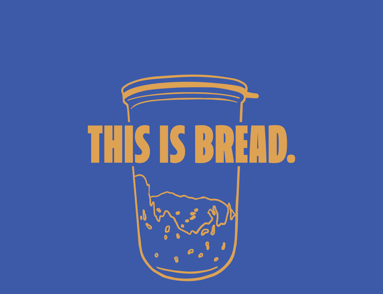
The sticker features a sourdough starter illustration overlayed with a bold, deadpan phrase. The design pairs playful, organic artwork with a straightforward statement, reflecting the brand’s hands-on approach and sense of humor.
