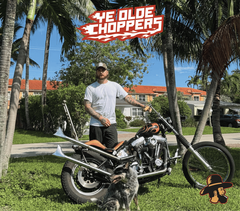
YE OLDE CHOPPERS
Blending heritage with biker culture
Building Badass Choppers
We build choppers in the spirit of doing things our own way. Cutting, welding, and shaping steel with our hands. Rooted in craftsmanship but never precious about it, we're here to make bikes, make noise, and have a damn good time doing it. This is a brand for like minded misfits who love the work, respect the ride, and don’t take themselves too seriously. No rules, no posturing, just honest builds, shared knowledge, and a loose knit crew keeping chopper culture fun, fearless, and alive. No egos, no rules, just welding, creativity, and pushing the boundaries of what is possible.
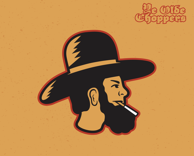
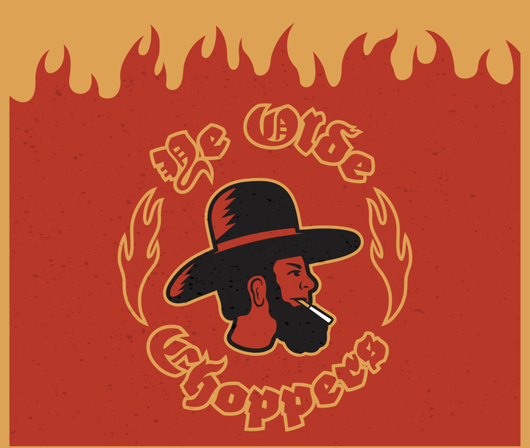
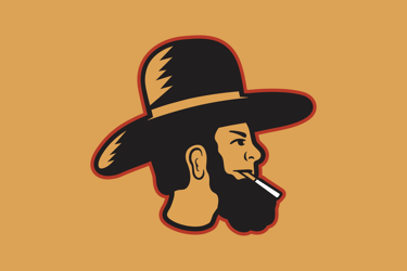
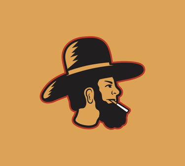
The Mascot
Inspired by the Pennsylvania Dutch and Amish communities, this bold, no frills, mascot reflects the grit, humility, and craftsmanship of Pennsylvania's roots. The logo bridges the Amish legacy of master builders with the raw art of hand crafting choppers, honoring a culture where everything is made by hand.
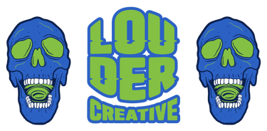
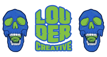
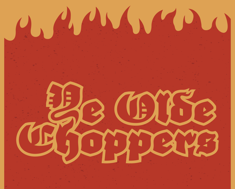
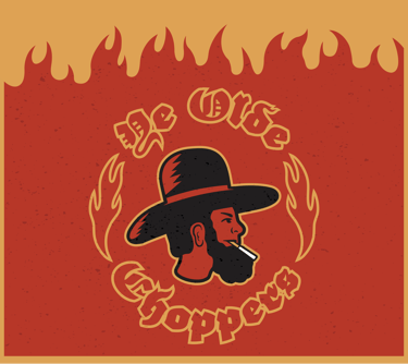
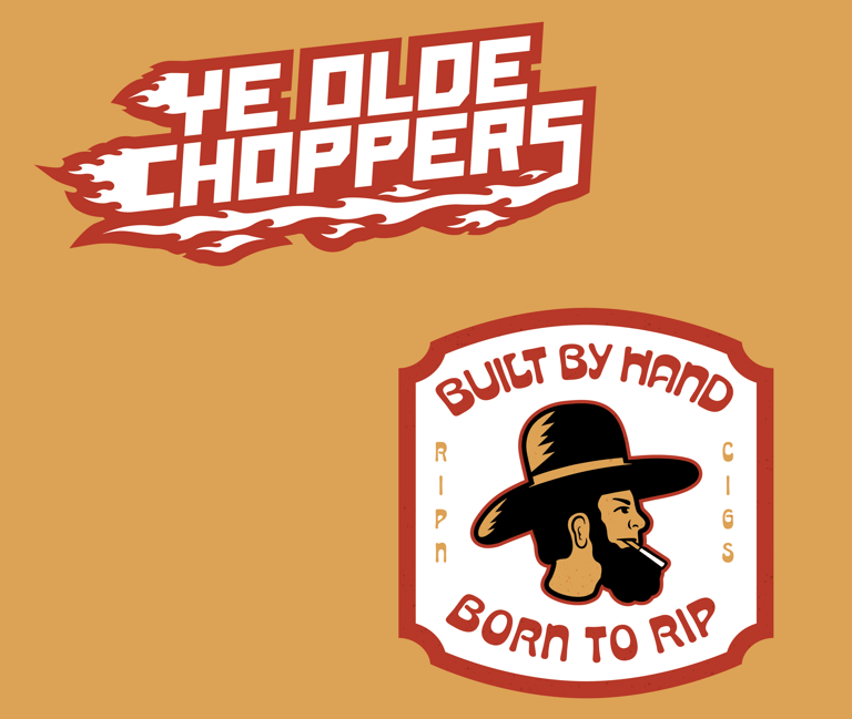
The Logomark
A bold circular mark built around a custom Amish mascot, a Germanic, Pennsylvania Dutch inspired typestyle, and flames synonymous with the biker culture. Heavy lines, high contrasting colors, with a raw handcrafted illustrative style. The result blends old world heritage with the attitude of custom built choppers.
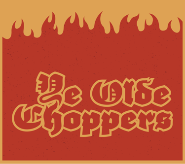
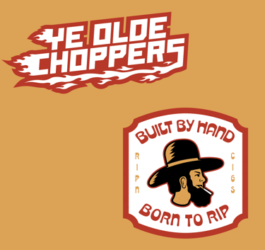
Logo Lockups
The horizontal version is perfect for those wide format areas. It's bold and balanced perfectly. A stacked version made for the narrow but tall formats. Breaking up the name to fit around the mascot while maintaining readability. A badge version with some extra flare best fit for any application.
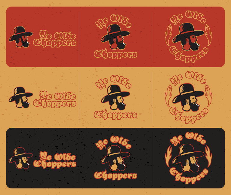
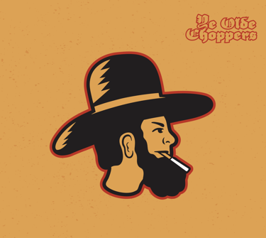
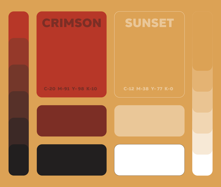
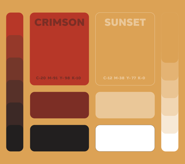
Color Palette
Crimson Red and Sunset Gold. A refined version of the classic Pennsylvania Dutch colors that pair perfectly with the flames known with the biker culture. They're bold, hot, and high-vis.
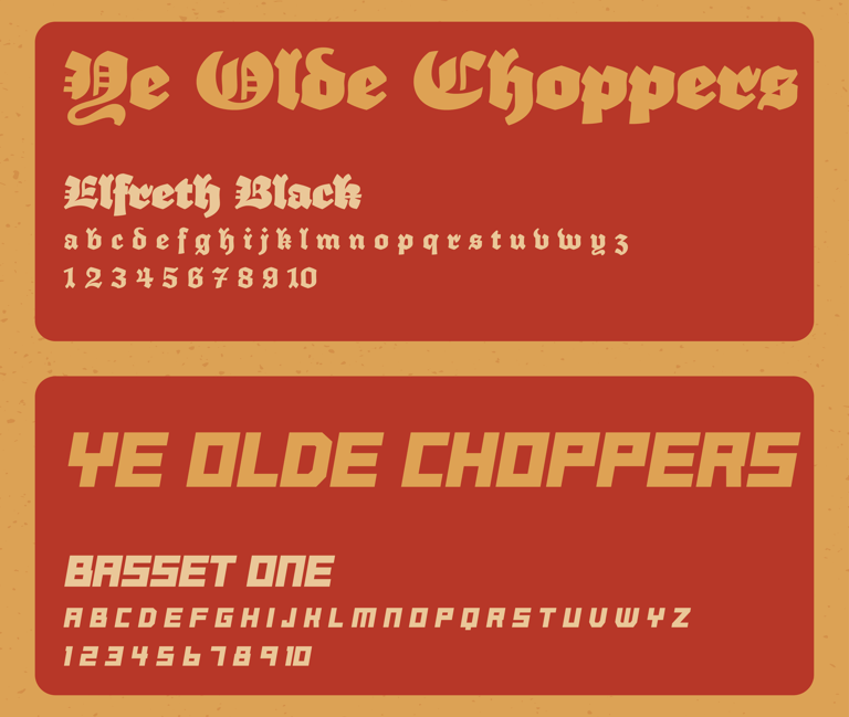
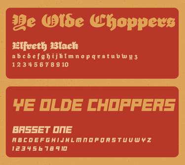
Typography
Big, heavy type in an old english style to encapsulate the region as well as the bold boundary pushing craftsmanship of building motorcycles. This is paired with a slightly less bold, easier to read sans serif font.
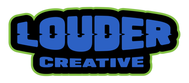
Secondary Logos
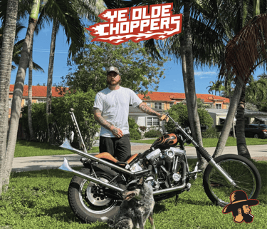
A secondary bold word mark crafted with motion and flames connecting to the famous chopper paint jobs.
A badge connecting the brand and a tagline of what this brand is all about, rippin choppers and building by hand.
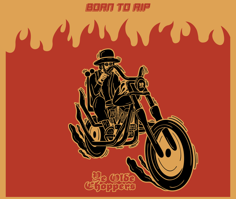
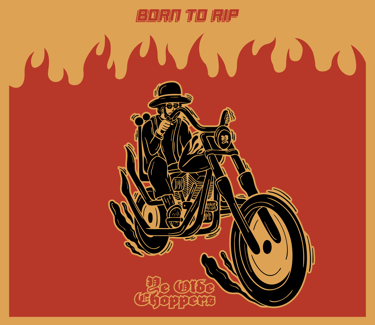
Born To Rip
Expanded upon the mascot mark, is a highly illustrated mascot rippin his shovelhead through the streets. Capturing the raw freedom, and attitude behind hand built motorcycles, it brings movement and personality to the brand.
We exist to honor hands on work, individual style, and the freedom to build without templates or permission.
© 2025. All rights reserved.